A guest blogpost from interior stylist, Lisa Cleary @alondonrenovation
Buy art that you respond to:
You bring your story to the art in your home. It is in this interaction that art can become an exciting part of interior design, in a way that doesn't necessarily happen with a cushion or a lamp - at least, not with the same immediacy. Art can be transporting, inspiring, joyous, melancholy, nostalgic. The most important thing is to buy art that makes you feel something. Choose art that makes you pause for thought - does it conjure a particular memory? remind you of a person? open a window to another place? or contain it’s own narrative? There is no right or wrong here and the reasons for connecting with a piece of art are as varied as we are as people; it could simply make you smile! Have confidence in your collection – this is your gallery and you do not need to answer to any curator except yourself.
Create tension:
I would caution against buying art to match a room's décor. Often the most exciting spaces are those where there is an unexpected tension between the rest of the room and the artwork. An exciting friction can be brought about by contrasting the colour palette of the room and that of the art. Other points of divergence can include the texture of a frame or the materials used, for example a three-dimensional piece made from natural materials shown in an industrial space.
Alternatively, you could use artwork to introduce a surprising or fun subject matter. You can also play around with context, giving a nod to a room's function, for example. In a previous property, we had a series of photos depicting Palm Springs' swimming pools in our dark toned, subterranean bathroom. These introduced contrast but also levity (and sunshine) to the space!
Cost is no indication of value:
Be it a postcard from a gallery, a small ceramic picked up at a carboot sale or an antique oil painting, the value of art in a home should be measured by how much it resonates with the person who chose to hang it on their wall. I can offer no insight into how to buy art as an investment but in terms of the value to your interior decoration, artwork can be priceless, breathing life into a room and transforming the space. Pick up pieces on your travels, rummage through flea markets, see what your gran has in the attic – a fresh mount and frame can bring tired-looking pieces right up-to-date.
Mixed bag:
A large format piece of art can offer an impressive centre-point but may not be bank balance friendly. In addition to budgetary considerations, large pieces often need to sit alone, and this doesn’t align with our magpie tendencies! Luckily, smaller pieces of varying sizes can be grouped into interesting little galleries – trios (and other uneven numbers) seem to work well. These groups can be tied together with simple connections between the pieces (one shared colour or a similar atmosphere running through each) but which still allow them to stand on their own as individual artworks. Don’t be afraid to contrast artistic styles and mediums in neighbouring pieces- again, think of creating tension. A small work on its own will draw the eye to find out more, inviting people to visit overlooked corners of a room. If you have something very small, a framer can increase scale of the piece with the use of a generous mount and frame, further emphasising it’s diminutive size and tempting the viewer in.
Hang, lean, move:
Those who follow my account will know that I am constantly moving the furniture, rugs and artwork around – especially during lockdown when changing the scenery felt even more important! Large pieces which need to be hung are perhaps a little trickier to relocate (although the Swiss cheese holes in our walls are testament that I do try) so more often I will layer propped up pieces against the wall. This is a more casual way of using art to style a room and it allows you to try things out in a particular space without committing. Even the most well-established galleries have a re-hang every few years so don’t be afraid to shake it up every now and then.
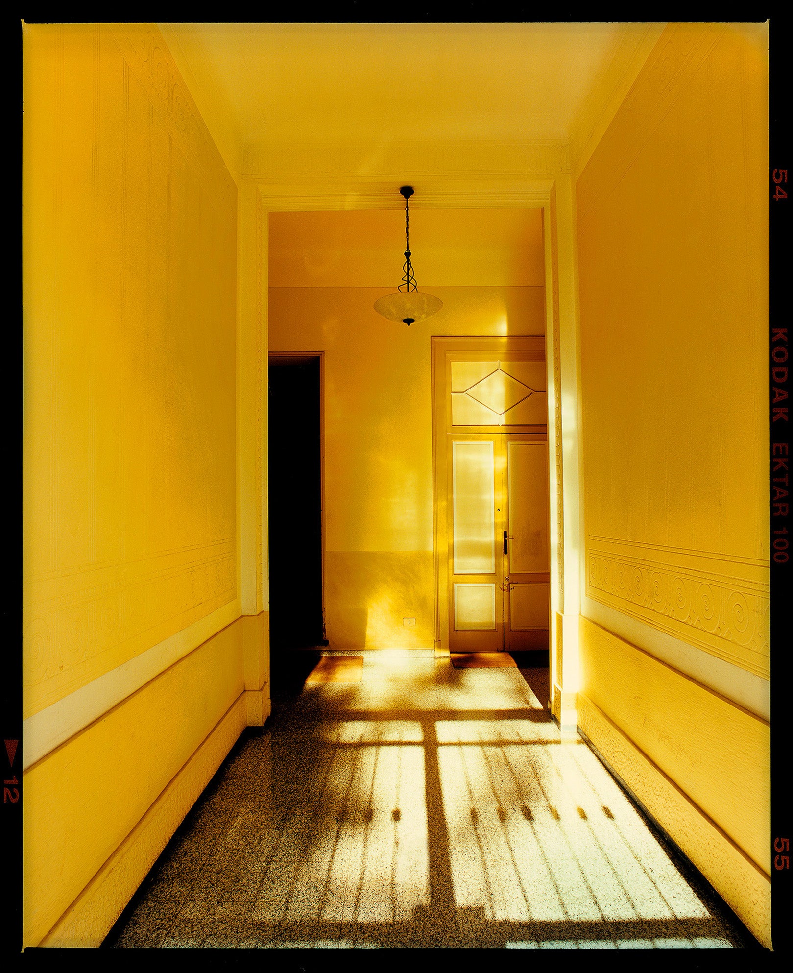
So now to the fun part - I have picked a small selection from Richard Heeps’ incredible portfolio of lens-based photography which I think would work in wide range of interiors. I love Richard's work because each piece looks like it is lifted from a storyboard. His work has a timeless, cinematic quality - you can almost see the supporting cast just outside the frame. I am lucky to have two pieces of Richard’s work at home (including Bible – Fisherman’s Mission, below). His work sets a tone of quiet sophistication around which you can arrange other pieces - I have combined his photographs with a variety of artistic styles, including painterly still life and bold slogan pieces. His photos have been toured around our house, offering something new to each space they have sat in. I wouldn’t hesitate in recommending Richard's work to enhance your interiors!


If you are interested in seeing how I have used Richard’s work at home, please visit @alondonrenovation and check out the ‘Art’ highlight.
Comments will be approved before showing up.


Matt Gleeson
March 21, 2021
Great article. I often find sourcing art a complete minefield and often wonder where to start. Extremely useful guidance and advice. I also love Richard Heeps’ work – incredible!
Thanks again.
Take care, Matt